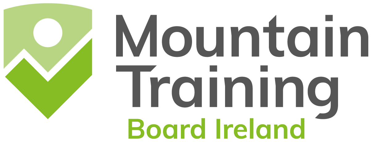
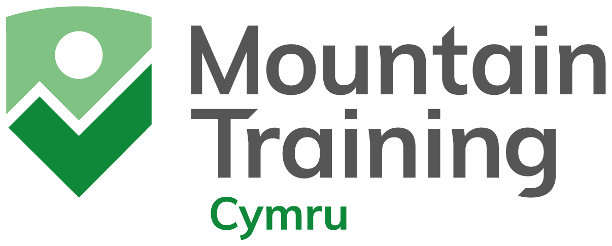
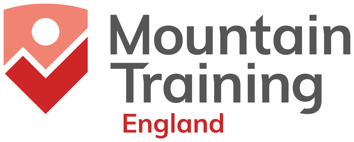
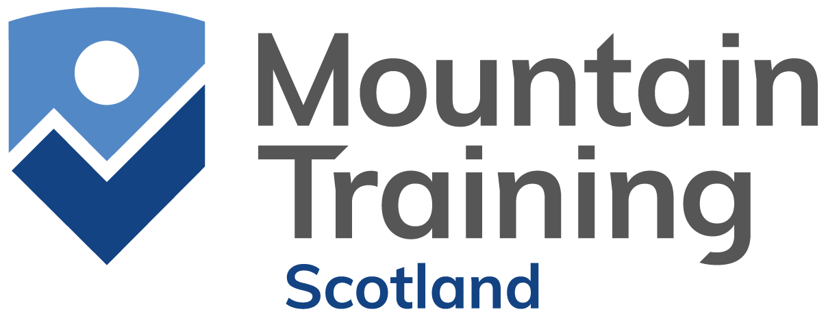
New Mountain Training logo
16.04.24Old logo
New logo
Why change the logo?
We've been an awarding organisation since 1964 and in that time our name and logo have evolved several times. Our qualifications and skills courses are well respected across the sector and around the world, and our 60th year felt like a fitting time to refresh the brand. Our main aim was to distinguish Mountain Training as the collection of awarding organisations for qualifications in the UK and Ireland. At present, many activity provider logos utilise a similar mountain-scape alongside their company name, and our old logo didn't stand out as an official awarding body.
The new brand mark, the shield, represents quality and trust, whilst maintaining a link to our origins in pointy places.
You may have noticed we've also updated the website in order to:
- better support people who want to know more about us
- improve site navigation
- improve digital accessibility
From an accessibility perspective, we’re aware that many of our candidates and providers have dyslexia or a visual impairment and while we know this can manifest differently in each person, there are design changes we have made that are likely to have a positive impact on the majority. We have also done our best to make sure the website is optimised for screen readers and browser translation software. The website will continue to be developed and improved. If you think there's something we've missed or could do better, please let us know by email: feedback@mountain-training.org